BTT Design System
I initiated and developed a cross-product design system to address a pattern I kept seeing across our product ecosystem: design decisions that accumulated not because of bad intentions, but because training was being used as a substitute for good design. What started as a formally pitched professional development initiative became a shared foundation referenced across five products — and eventually, a tool that allowed developers to produce higher quality UI work without requiring constant design involvement.
overview
The Problem
As Wycliffe Associates' product ecosystem grew, a clear pattern emerged across applications: interfaces were being built around an implementation model rather than a user model. Because our products relied heavily on facilitator-led training, poor design decisions were allowed to accumulate — if something was confusing, training could compensate. This created a growing debt of interfaces that were only usable because someone explained them first.
The symptoms were visible across the product suite: default framework styling with minimal modification, inconsistent color and typography usage, fragmented component patterns, and no shared baseline for what "good" looked like. Design was frequently applied after features were built, making fixes reactive and increasingly expensive over time.
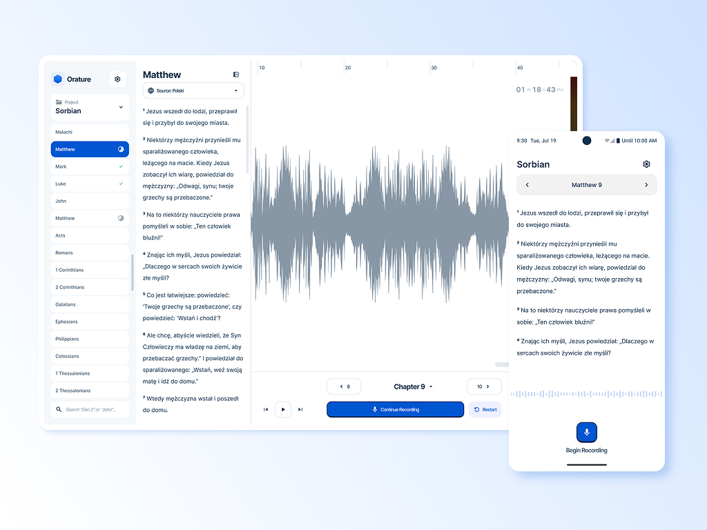
Orature's onboarding flow is a clear example of this pattern in practice — a multi-step configuration sequence that required a dedicated facilitator to complete, where any missing step rendered the application completely non-functional. The complexity wasn't designed, it accumulated.
It became clear that ad hoc decisions wouldn't scale, and that a shared foundation was needed — not just for visual consistency, but to raise the floor on design quality across the entire ecosystem.
Origin & Approach
I pitched the design system formally as an opportunity to tackle design debt — framing it in language developers already understood from their own technical debt work. The proposal had two additional angles that helped secure approval: it was an opportunity to build my own knowledge of atomic design and design systems methodology, and it would serve as an onboarding resource for the design intern we were actively recruiting at the time.
The initiative was approved quickly. I built the system incrementally — working on it between active project tasks rather than as a dedicated sprint — which meant it grew organically alongside real product needs rather than in isolation.
Goal
The BTT design system was created to accelerate design workflows, reduce design debt, and empower the development team to make stronger design decisions independently, without relying on constant design consultation.
Constraints
Implementation varied across projects due to differences in front-end technologies, and without formal versioning or a governance model, adoption relied on shared reference and team influence rather than enforcement. The system's reach was ultimately shaped more by design maturity and relationship than by mandate — which taught me as much about organizational change as it did about systems architecture."
System Architecture
Foundations
The system was heavily influenced by atomic design principles and the Material Design standard, which helped establish a shared baseline across applications
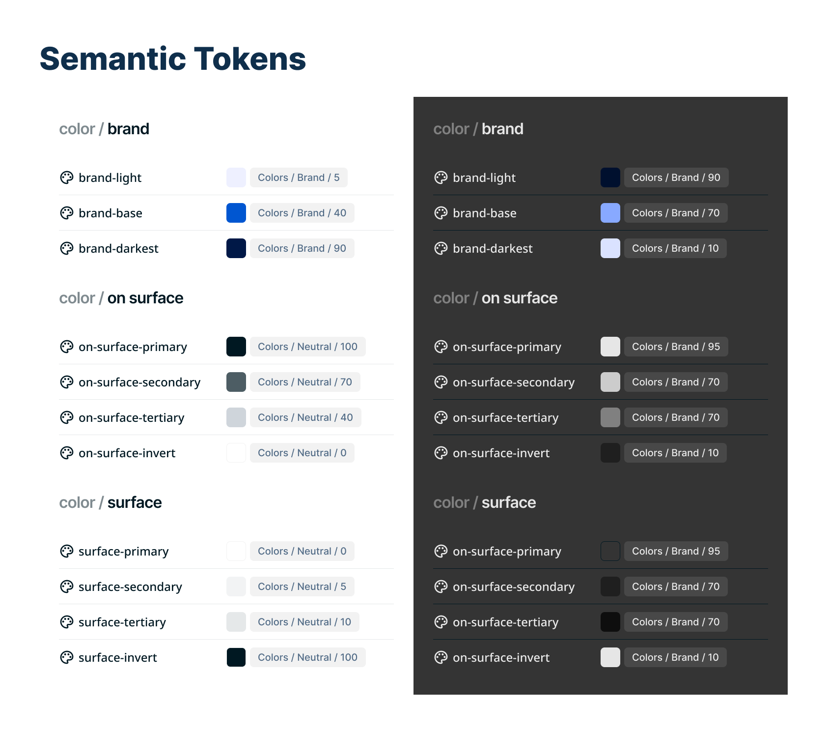
Semantic color tokens (structured for theme flexibility)
Light and dark mode support
Typography hierarchy
Defined interaction states
WCAG AA contrast targets (minimum)
I intentionally stopped at the semantic token tier rather than introducing component-level tokens. Given the scale and technical limitations of our ecosystem, this provided sufficient flexibility without unnecessary architectural complexity.
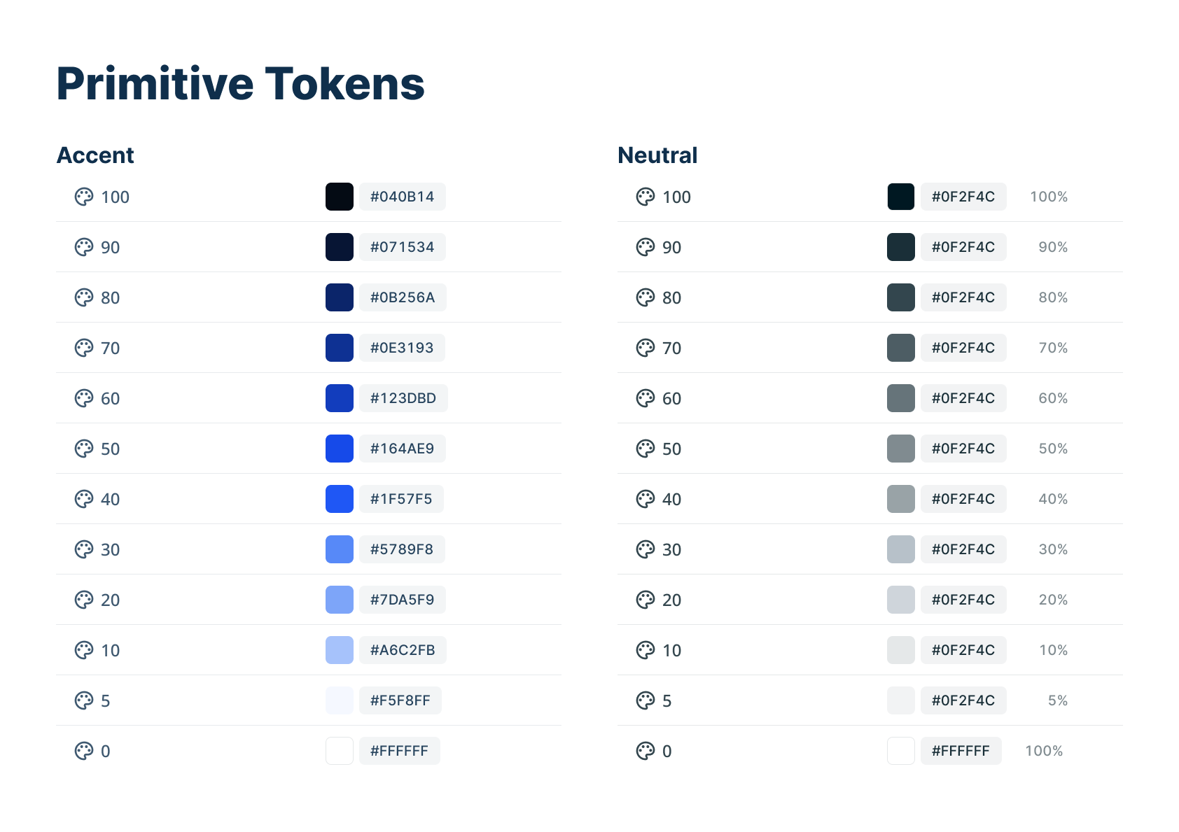
Primitive tokens make up the base for the colors in the design system
Semantic tokens simplify design choices.
Spacing
Spacing was partially standardized, though not fully formalized at the time due to tooling and technical constraints. I loosely based everything on a 16 point grid. If rebuilt today, I would implement a clearer spacing scale and breakpoint strategy to improve cross-platform consistency.
Icons
Iconography was also standardized, as icons frequently represent key concepts such as “target language” and “source audio.” While some individual selections could be refined, establishing a consistent set strengthened meaning across contexts and reduced ambiguity. Clear naming conventions and component descriptions helped communicate intended usage to the development team.
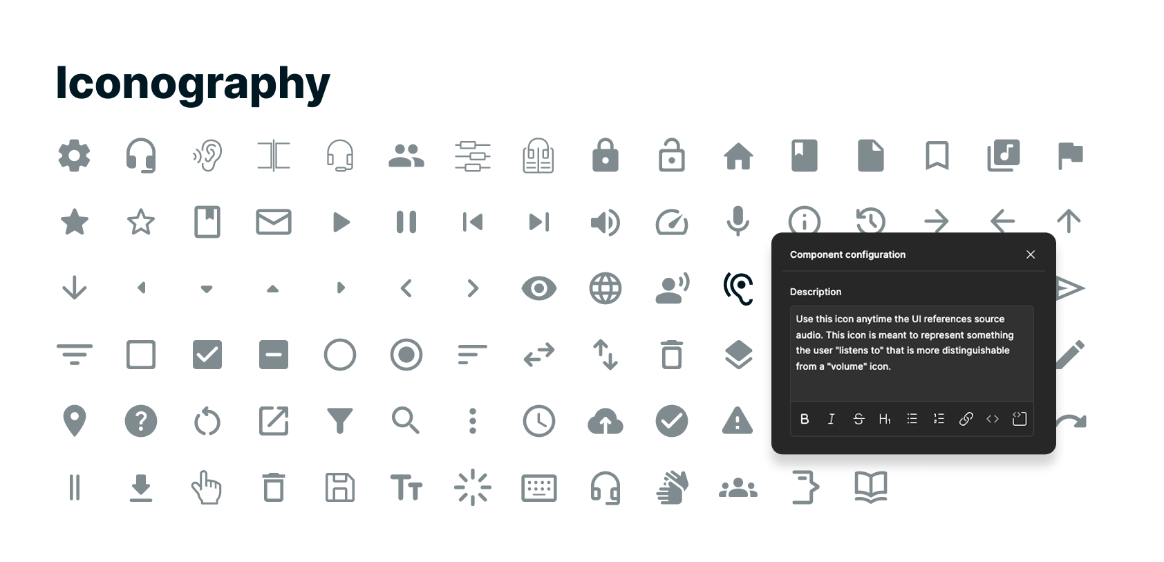
We used mainly Material Design icons, with a few custom ones.
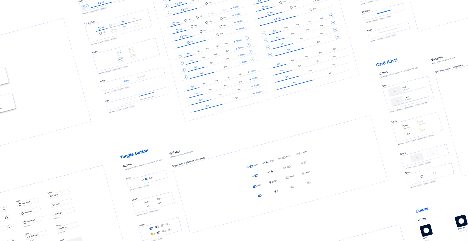
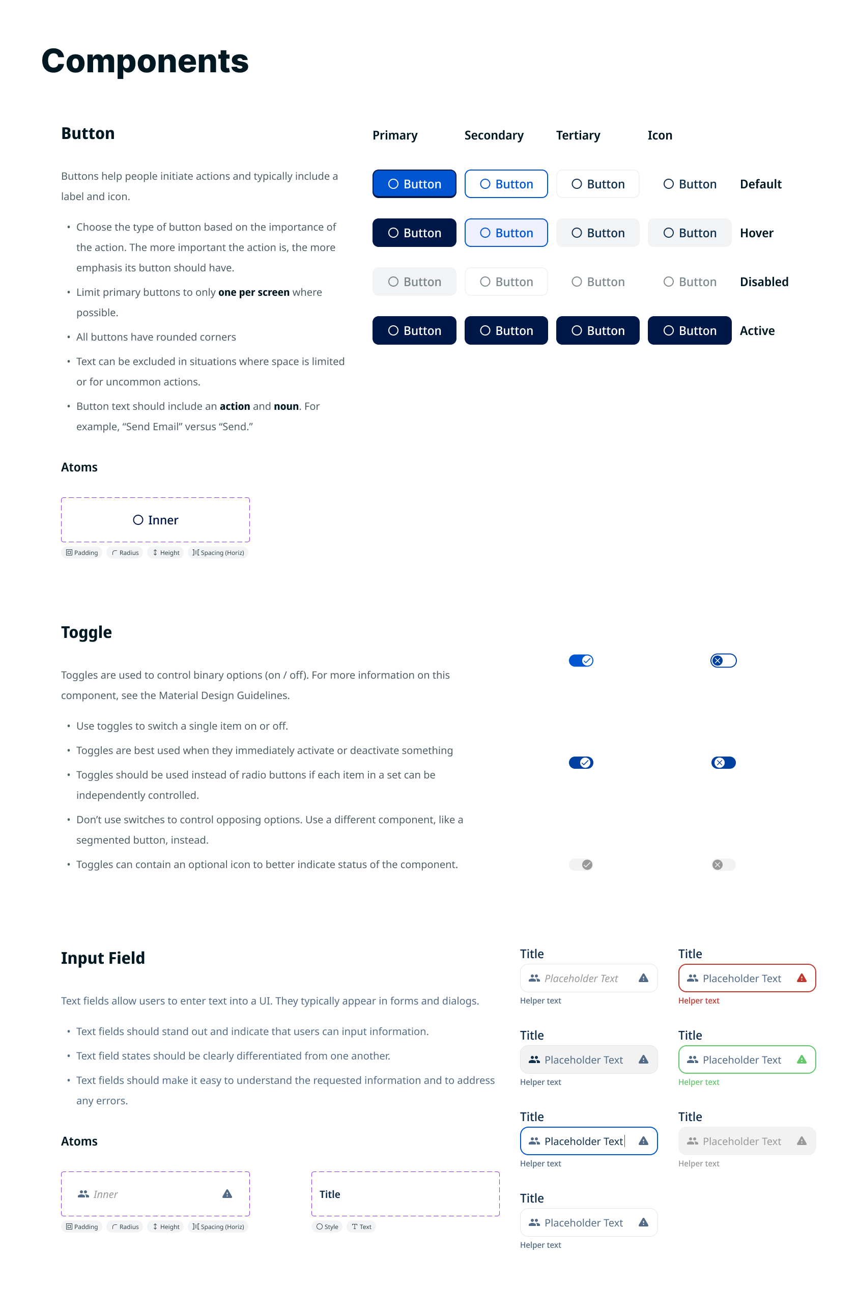
Components
The system defined a small set of core components—buttons, dropdowns, and primary form inputs. Although it did not scale to cover every pattern in the growing ecosystem, standardizing these foundational elements created alignment across products. More complex UI patterns, such as modals, were built from these shared building blocks, leading to more consistent results with less effort.
Component Characteristics
Atomic Structure: Components were built from smaller atoms to allow flexible updates and improve consistency. For example, adjusting an icon position at the atomic level updates every related button instance.
Defined States & Variations: Components include common interaction states and documented variations (e.g., with or without icons, helper text, and other permutations) to reduce ambiguity.
Accessibility by Default: All components meet WCAG AA standards at minimum, with larger touch targets and improved text sizing. This supports users with limited dexterity and improves readability when interfaces are projected or viewed on larger displays.
Common design system components with clues indicating each atom's purpose.
Results
Impact
The most telling measure of the system's success isn't the component count — it's what happened when designers and developers used it without direct involvement from me.
Developer independence: The clearest signal came from a developer-built web application created entirely without designer input after the system was established. The result — consistent dark mode implementation, clear typographic hierarchy, predictable layout patterns — reflected the system working as intended. Developers were no longer defaulting to bare framework styling; they had a reference point and the confidence to use it.
Intern onboarding: When I onboarded our design intern, the system served as an immediate foundation. Rather than spending time establishing basic visual language, we could focus on higher-order design decisions from the start. One of those interns was subsequently hired full-time.
Ecosystem consistency: Across approximately 5 products, the system established a shared design baseline that reduced visual fragmentation, improved accessibility compliance to WCAG AA standards, and gave both designers and developers a common vocabulary for design decisions.
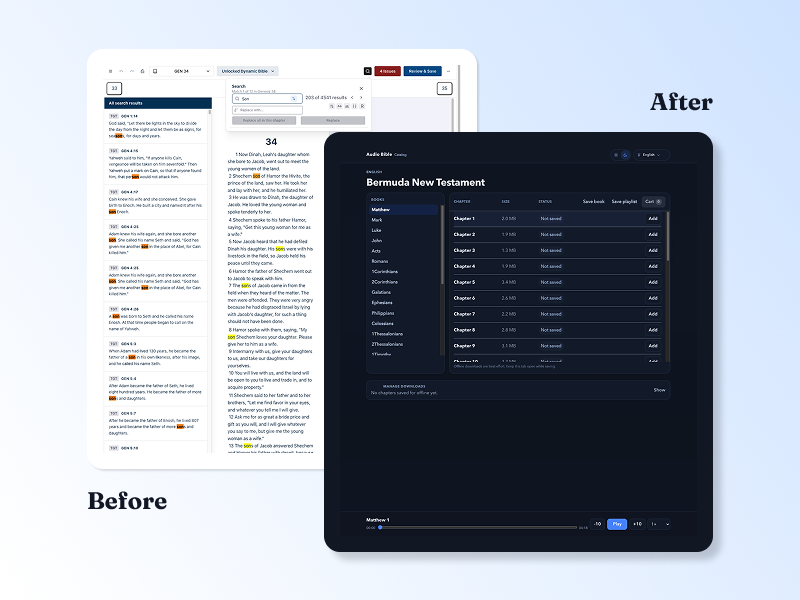
Before / After
The comparison below illustrates the quality gap the system was built to address. The left shows a product currently in rapid iterative development where UI polish is intentionally deferred in favor of speed — representative of the pre-system default state. The right shows a developer-built web application created after the design system was established, without direct designer involvement. The improvement in hierarchy, consistency, and spatial clarity reflects the system's influence.
Key Learnings
Building the system clarified how architecture, governance, and technical constraints interact in real-world environments.
Governance is as important as architecture — even a well-built system drifts without clear ownership. If rebuilt today, I would establish a lightweight contribution model and versioning process from the start rather than relying on shared reference and influence alone.
Platform and front-end constraints must shape system decisions
Designing for light and dark themes requires eliminating edge cases early
Systems thinking improves long-term maintainability
Future Iteration
If implemented within a more formally supported structure, the system would benefit from clearer governance and deeper architectural rigor.
Formal versioning
Defined contribution model
Standardized spacing scale
Clear responsive breakpoint strategy
Stronger alignment between tokens and front-end implementation
More Projects
Dovetail: A web-based translation refinement tool shaped entirely by research before a single production screen was finalized. This case study documents the discovery process, key research findings, and the design decisions that followed. Read Case Study
Spotlight: A mobile-first lexicon tool built in direct response to field research. This case study covers the research that drove a platform decision, the usability testing that shaped the design, and what it looked like to validate assumptions in the field. Read Case Study
Orature: A desktop oral translation tool that launched with strong technical capability and limited adoption. This case study is an honest post-mortem on what went wrong and includes a full strategic redesign proposal. Read Case Study