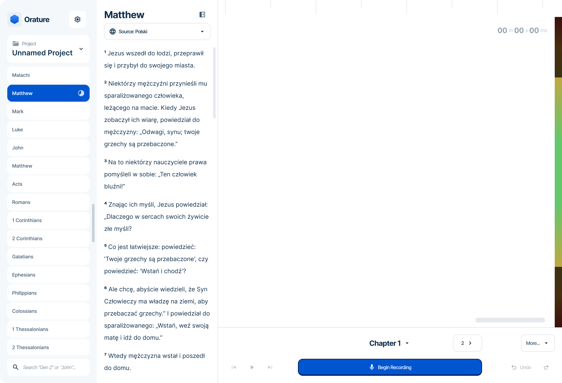
Orature
Orature is a desktop application built to support structured oral Bible translation workflows and replace a simpler legacy tool. While technically capable, the product revealed critical gaps in platform strategy, workflow validation, and onboarding design that limited adoption in low-resource environments. As the sole designer, this project reshaped my approach to product discovery, MVP scoping, and constraint-driven design. This case study examines where assumptions diverged from reality — and how I would strategically redesign the product today.
Overview
Problem Statement
Several languages around the world exist within an oral-only context and options to translate and preserve that language are limited or overly complex.
My Role
Role: Lead UI/UX Designer
Ownership: Field observation, UI design, Usability Testing
Team: Software developers, product owners, and stakeholders.
Platform: Windows, Linux, and MacOS
Timeline: ~ 4 years
Context & Constraints
Orature was developed within technical, organizational, and environmental constraints that directly shaped design decisions and limited iteration velocity.
Technical Constraints
JavaFX Front-End: Limited layout flexibility and no true responsive breakpoint system, requiring a single adaptive layout across varied screen sizes.
Desktop-First Architecture: Platform decisions were established early, limiting exploration of alternative device strategies later in the project.
Organizational Constraints
Engineering-Led Decision Making : Core features were often defined before UX exploration, limiting opportunity to shape foundational interactions.
Evolving Design Culture: Design was initially integrated later in the development cycle, primarily focused on interface refinement rather than upstream product strategy. Strategic influence increased over time.
Audience and Environmental Constraints
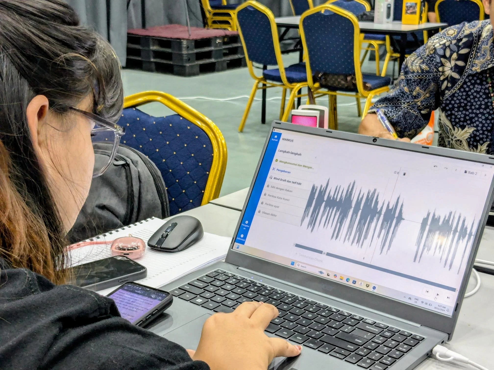
Low-Bandwidth Environments: Users often operate offline or with minimal connectivity in very remote locations, limiting research access and increasing dependency on assumptions.
Language Barrier: Most of our users do not speak English, which often made getting feedback incredibly difficult when we could.
Field Response
Orature launched to the field in 2022 with the expectation that expanded functionality and more powerful hardware would drive adoption. Instead, real world usage revealed structural barriers that limited uptake and reshaped how the product was actually used:
Security Concerns: In sensitive regions, laptops were viewed as a liability. The platform choice alone significantly slowed adoption among the intended audience.
Lack of Internal Advocacy: Frequent product ownership changes meant there was no consistent champion to promote, position, or support the tool post-launch.
Unexpected use case: Orature found moderate traction as an audio narration tool rather than as a structured oral translation workflow solution.
Feature-Value Misalignment: Increased capability did not translate into perceived value for the primary audience.
Misaligned Assumptions
Orature was built on a set of unvalidated assumptions about user capability, workflow, and platform strategy. Once deployed, real-world usage revealed meaningful gaps between what we designed for and how teams actually worked.
1. Designing for the Extreme User
Assumption: Users were largely illiterate and highly tech-averse.
Reality: Many users were comfortable with smartphones and common UI conventions while frequently being frequent in a trade language.
To reduce cognitive load, we minimized text and relied heavily on icon-driven interfaces. In practice, this created ambiguity, even for internal trainers. Clarity suffered in the name of simplification.
Lesson: Designing for perceived disadvantage without validating the median user leads to oversimplification. Confidence and clarity matter more than minimalism.
2. Optimizing for Capability over Context
Assumption: More powerful desktop workflows would increase adoption.
Reality: Laptops introduced access limitations, security risks, and hardware anxiety for many of our users.
While desktops enabled advanced functionality, they reduced deployability. Recorder, though simpler, was safer and easier to distribute and use. Platform choice became the primary barrier.
Lesson: Platform strategy must account for infrastructure, risk exposure, and accessibility - not just capability.
3. Enforcing Process Instead of Supporting Behavior
Assumption: Software would play a crucial role in the translation workflow.
Reality: Many users translated on paper and used Orature primarily for narrating the content.
Our primary “translation mode” added friction because it prescribed a methodology rather than accommodating observed behavior.
Lesson: Workflow design should validate existing behaviors before formalizing them in software.
4. Front-Loading Configuration
Assumption: Extensive upfront setup was acceptable if it enabled long-term flexibility.
Reality: Immediate usability was more critical than configurability.
Onboarding required project setup, language alignment, and installing source content before any meaningful work could begin. Any snag in this multi step process rendered Orature completely useless.
Lesson: Time to value matters more than structural completeness in constrained environments.
5. Structural Process Gaps
Assumption: Orature needed to be refined and stabilized as a product before exposing it to the field.
Reality: Extended refactoring and late-stage UX involvement delayed meaningful validation
Significant time was spent rewriting and restructuring core functionality before it had been tested in real-world conditions. At the same time, design was often introduced after foundational decisions were already implemented, limiting influence over structural workflows.
Lesson: Early validation is more valuable than architectural polish. Discovery and design alignment must happen before systems harden.
Strategic Redesign
If given the opportunity, I would like to propose a few significant changes to Orature’s design that factors in more accurate workflows, real world constraints, and accurate user needs.
1. Onboarding Experience
My redesign begins with onboarding. The current experience introduces unnecessary barriers and does not align with real-world usage.
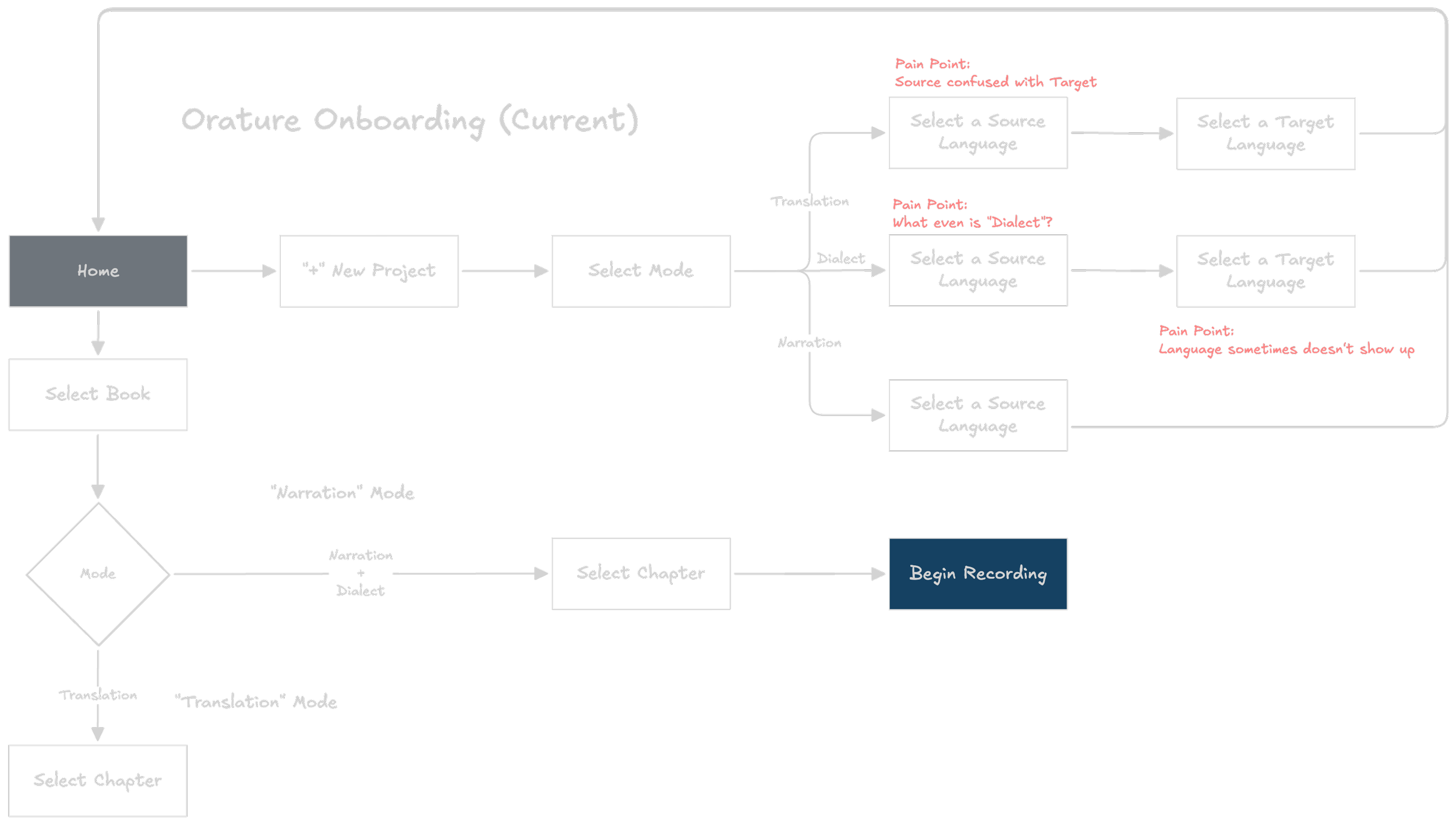
Orature’s user flow highlights some key pain points that leaves a bad first impression on many users.
Modes
The redesign removes the concept of “modes” and sets “Narration” as the default experience. Narration became the preferred workflow among early adopters, and the distinction between modes (such as “Dialect”) was generally unclear.
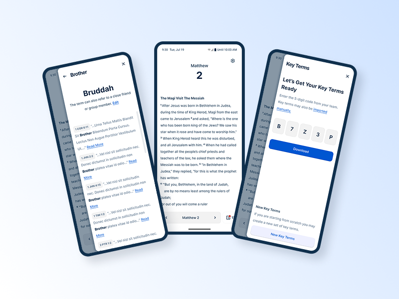
Language Setup
Orature requires users to declare source and target languages to determine versification structure and file metadata. While these requirements remain necessary, the experience can be made significantly more flexible.
Source Language: Rather than locking this during setup, it can be selected or changed at any time within the reference panel.
Target Language: This identifies the language the content is being created for and supports reporting needs. In the redesign, this is only required when exporting or transferring content. It may also be set in advance by a technician if needed.
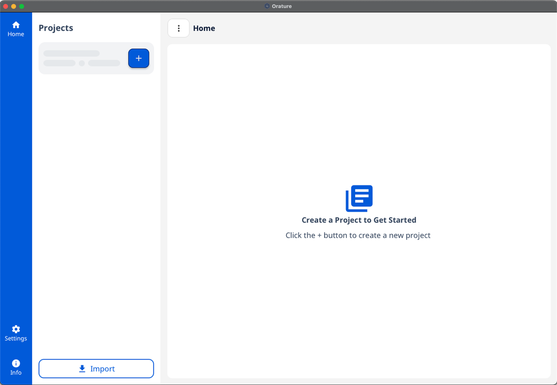
Home / Empty State
The current home screen provides little direction and offers no immediate value. The redesign drops users directly into the narration workflow using smart defaults:
Project Name: Defaults to “Unnamed Project.” Users are encouraged to rename it later, or it can be configured in advance by a technician. This will adopt the target language once it is set.
Source Language: Defaults to the operating system language, with English as a fallback. It remains editable at any time.
Book: Defaults to the first chapter of the New Testament. This can be adjusted to reflect training recommendations.
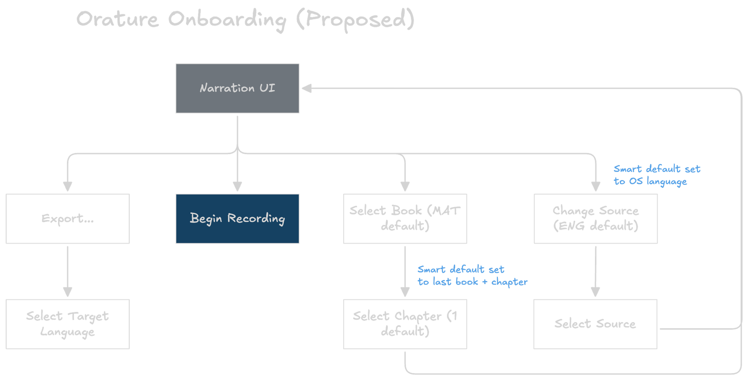
A simpler onboarding approach
2. Home Design
The goal of the redesigned home experience is to clearly communicate Orature’s purpose and allow users to begin working immediately.
BEFORE: Orature’s current home page empty state
Source Text: Relocated to the left side of the screen and visually aligned with other applications in our ecosystem to improve consistency.
Color:Reduced overall visual intensity to allow primary actions to stand out more clearly.
Narration as Default:Since recording is the primary user activity, the interface prioritizes the recording workspace as the default view.
Project Navigation: Book and chapter selection are combined into a single, accessible interface rather than split across separate views.
Best Practices: The redesign adopts established interface conventions rather than introducing custom interaction patterns. The current home screen does little to communicate purpose and provides no utility without completing onboarding
AFTER: Oratures’ proposed home page design
3. Mobile Accessibility
The next phase of the redesign introduces a mobile port. A primary barrier to adoption was desktop inaccessibility, particularly in security-sensitive regions.
To make a mobile transition viable, Orature’s identity should shift toward a focused audio recording tool. This requires reducing feature scope.
Single Project Model: Most translators work on one project at a time. Removing advanced project management simplifies the interface and supports use on personal smartphones, which has been shown to reduce hardware anxiety.
Source Audio: Shifting fully to a narration workflow removes the need for embedded source audio and its associated management features. This also preserves device storage for recorded content.
Audio Editing / Formatting: Advanced editing and formatting features would be excluded from mobile, as they do not translate well to a small form factor. This may include:
Audio editing tools
Verse marker management
Third-party handoff (e.g., open in Audacity)
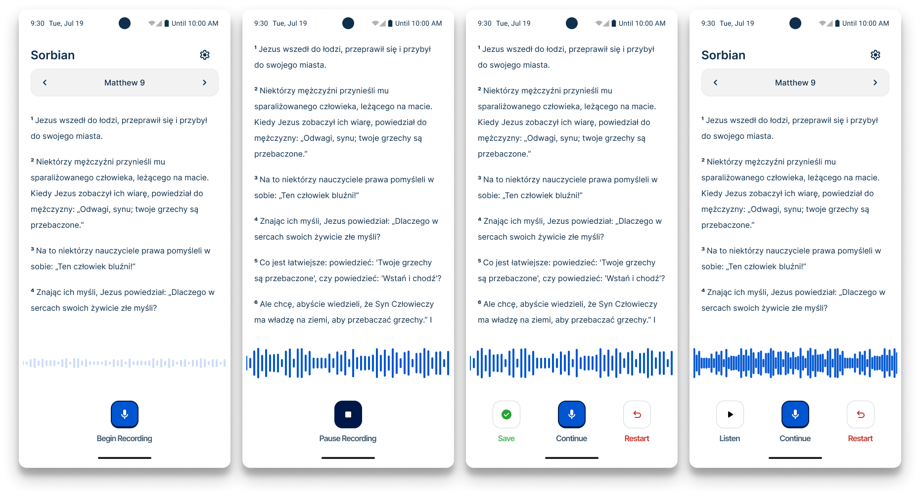
Orature’s mobile design concept focuses solely on simple audio narration.
Final Thoughts
Orature remains in use among a small number of teams and continues to surface valuable feedback. While adoption did not meet its original ambition, the project significantly shaped my product judgement.
Orature strengthened my conviction that:
Assumptions must be behaviorally validated.
Platform decisions are UX decisions.
Security and environment are usability factors.
Immediate value determines adoption.
Design influence must begin before architecture hardens.
More Projects
Dovetail: A web-based translation refinement tool shaped entirely by research before a single production screen was finalized. This case study documents the discovery process, key research findings, and the design decisions that followed. Read Case Study
Spotlight: A mobile-first lexicon tool built in direct response to field research. This case study covers the research that drove a platform decision, the usability testing that shaped the design, and what it looked like to validate assumptions in the field. Read Case Study
BTT Design System: A cross-product design system built from scratch across five applications. This case study covers the architecture, the tradeoffs, and what building a system without formal governance actually looks like in practice. Read Case Study