Spotlight
Spotlight is a mobile-first lexicon tool designed to reduce spelling inconsistencies in low-resource languages that lack standardized orthographies. Beyond the product itself, Spotlight represented a meaningful shift in how design was practiced at Wycliffe Associates — the first major product where design led problem definition from the start, with cross-functional collaboration built in from day one rather than added after the fact. I served as lead designer across the full lifecycle: research, product definition, interaction design, and usability testing.
About
Problem Statement
Spotlight supports Bible translators working in languages without formal written orthographies, where inconsistent spelling leads to reduced translation quality and significant manual correction effort. By making key word data accessible on mobile devices, Spotlight aims to improve consistency while fitting seamlessly into existing translation workflows.
My Role
Role: Lead UI/UX Designer (12 months)
Ownership: Led problem definition, research, product direction, interaction design, usability testing, and design handoff
Collaboration: Worked closely with developers, product owners, and stakeholders to align MVP scope and feasibility
Scope: Mobile-first product (Android), early-stage MVP validation
Success Metrics
1. Improve Quality: Translation quality should improve over time and errors should decrease throughout the drafting process.
2. Minimal Disruptions: Integration into existing workflows should be seamless with minimal training.
3. Learning Focused MVP: Spotlight should surface remaining problem areas through real-world use to inform iteration and future releases.
User Archetypes
Spotlight supports Bible translation teams working in low-resource, global contexts. User needs vary by role, but both groups operate under significant constraints around hardware access, literacy, and training time.
Translators (Primary)
Fluent in a gateway language and their mother tongue (often a low-resource language)
Limited access to desktops; smartphones are more common and trusted
Wide variance in literacy and technical proficiency
Prefer collaborative, in-person workflows over solo work
High hardware anxiety; interfaces must be simple and forgiving
Measure quality by consistency, accuracy, and understandability
Facilitators
Fewer in number; recruited for organizational and technical capability
Manage logistics, setup, and technical support during translation events
Often multilingual; communicate with translators via a shared gateway language
Rely on training, shared resources, and logistical support (hardware, space, meals)
Coordinate with regional managers, often with limited direct organizational access
Research and Discovery
Challenges
Launch Delay: We ran into scheduling conflicts that kept us from launching a prototype to the field on time. This extra time allowed us to spend more time prototyping and running mock events.
Limited Data: Most of our software needs to run offline and limits real-time analytics.
Proxy Users: We needed to supplement field insights with proxy users who share key behavioral characteristics. This allowed us to iron out more kinks in the early design and get Spotlight to a more refined state for early field testing.
Limited Training Time: We needed to rely on leveraging smart defaults where possible to make up for the lack of training time.
Key Problems
Hardware Anxiety: Our users are often very hesitant around unfamiliar hardware. Spotlight should be designed mobile first and target our users’ personal devices.
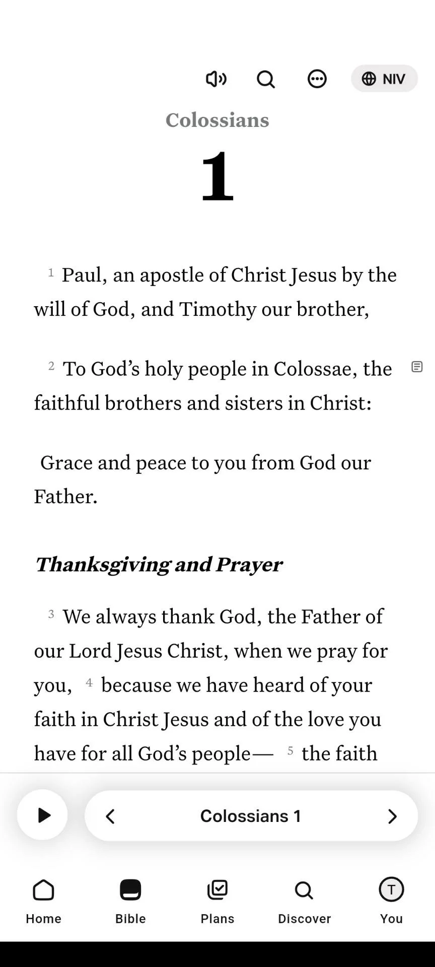
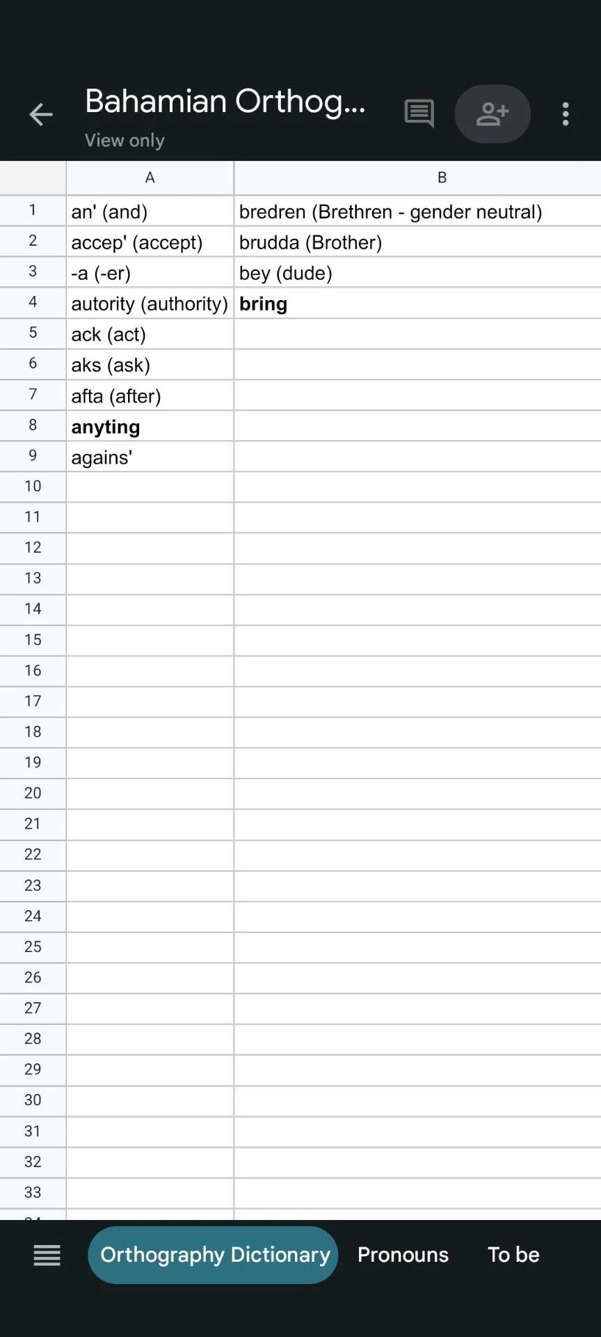
Unofficial Orthography: Low resource languages don’t always have a well established orthography which often introduces several spelling errors.
Distribution: File sharing frequently causes friction during onboarding. A more straight-forward solution will be necessary for sharing key terms.
Context: Current solutions lack crucial information that is needed to recognize phonetically spelled words.
Competitive Analysis
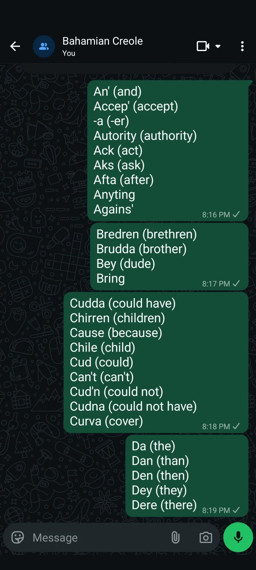
Early research highlighted some creative ways our users were solving their pain points, such as tracking words through a spreadsheet or a group chat.
YouVersion:
Commonly used by our audience and effective for accessing Scripture, but lacks features our users need for drafting.
Google Sheets:
A common solution used to track spellings, but disconnected from translation context and cumbersome to use.
WhatsApp:
An alternative to Sheets that also served as the primary form of communication amongst translators.
Wireframes & Ideation
Research encouraged a mobile form factor. Early ideation focused on how the user interacted with their key terms and identifying solutions for synchronizing data across teams.
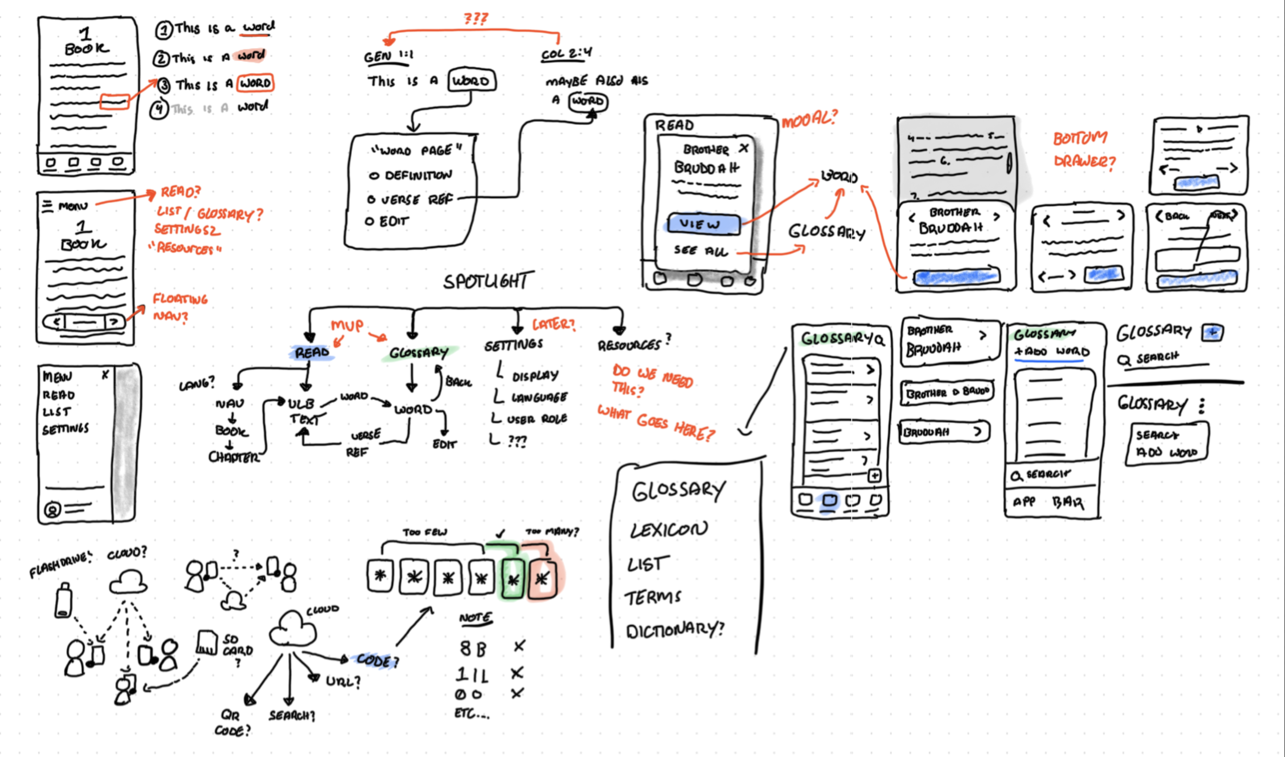
A snippet of “whiteboard” drawings at the early stage of design.
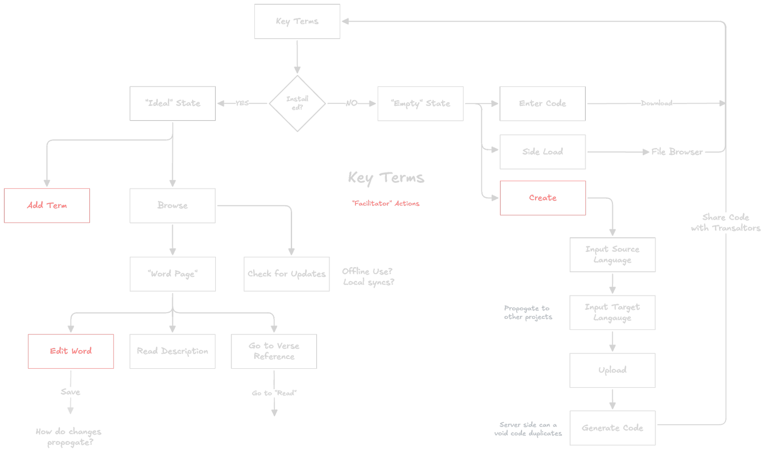
Early user flow chart focused on identifying various states for the key terms.
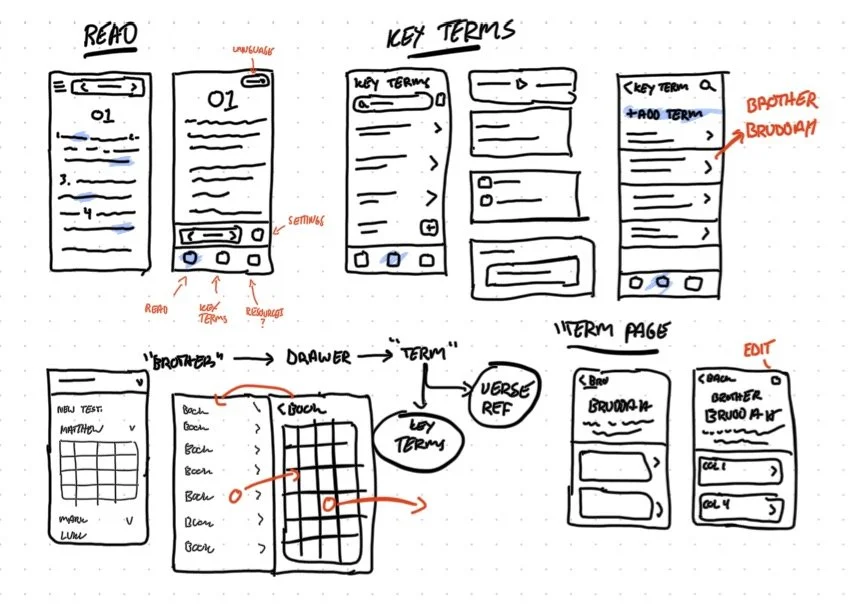
Some more mobile layouts of additional screens.
User Testing
Early prototypes were loaded onto tablets and tested in moderated 1:1 sessions with proxy users, focusing on navigation and word data workflows.
Confusing Navigation
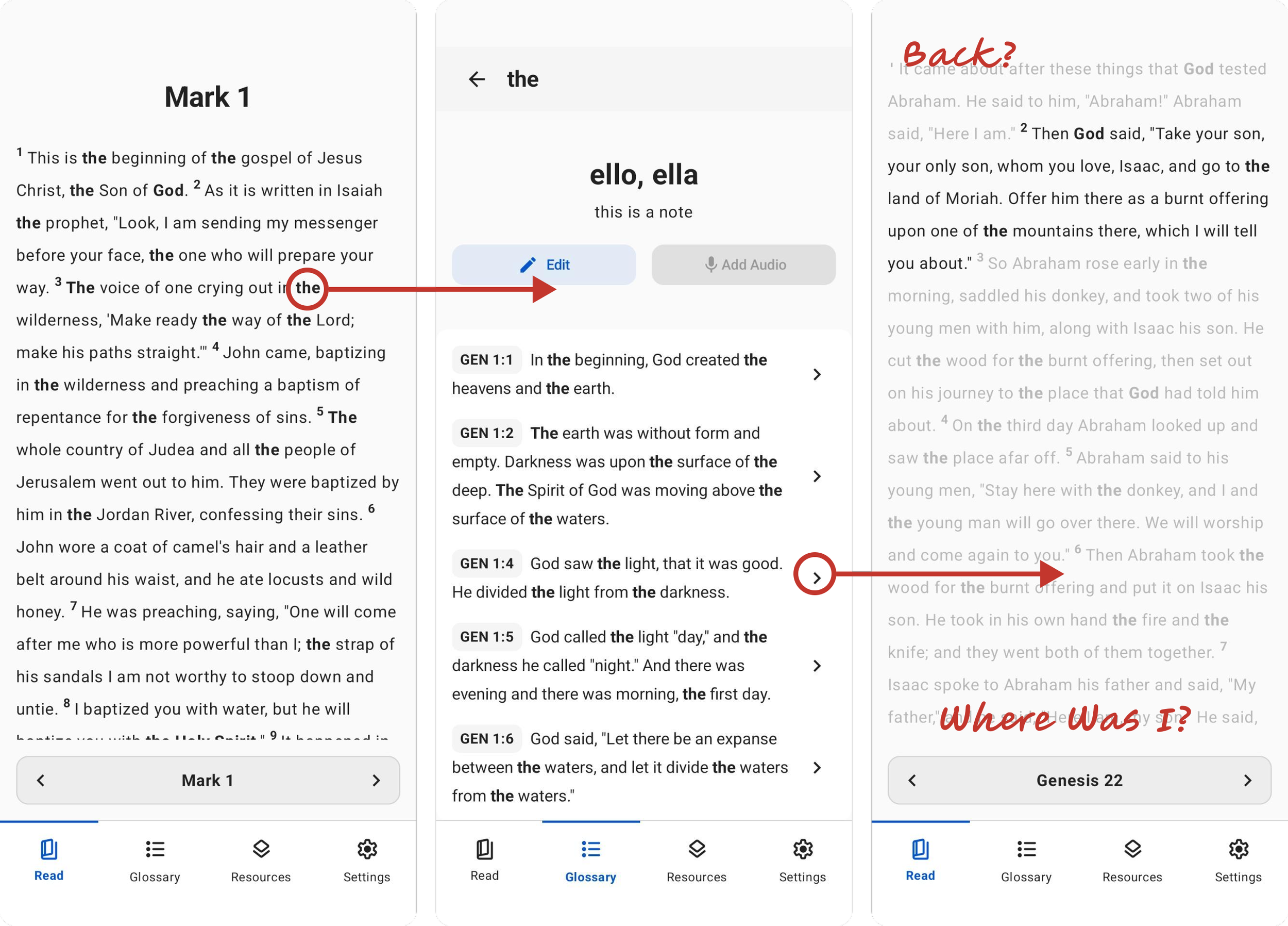
Users struggled to navigate the app, especially after viewing verse references, often having to manually navigate back.
Changes: Consolidate steps into fewer actions to move through the app, include a back button and remove distractions on the “Reference” page.
Unclear actions
Users struggled with identifying some elements as buttons determining what they did. The word drawer in particular was a common offender.
Changes: Key actions will always include a label that describes what happens.
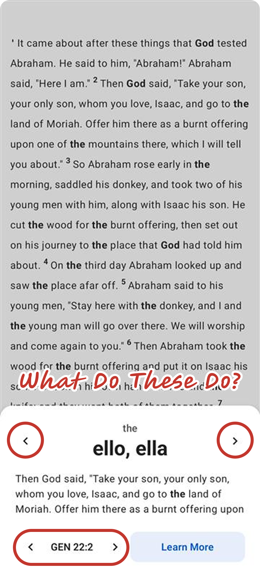
Poor legibility
Inline visual indicators for key terms became distracting, especially for common terms such as “the.”
Changes: key terms will no longer be highlighted and this information can be accessed through a single button instead.
Stacked Key Terms
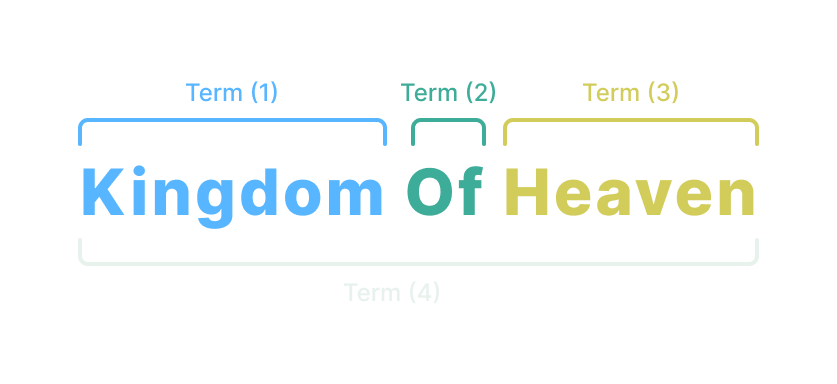
Some users were running into issues where one key term was a part of a larger phrase that was also a key term. “Kingdom,” “of,” “Heaven,” and “Kingdom of Heaven” could all be key terms, which often had frustrating results.
Changes: Key Terms are displayed in a clearer interface that doesn’t require clicking on a specific word. This also removes the need for the word drawer.
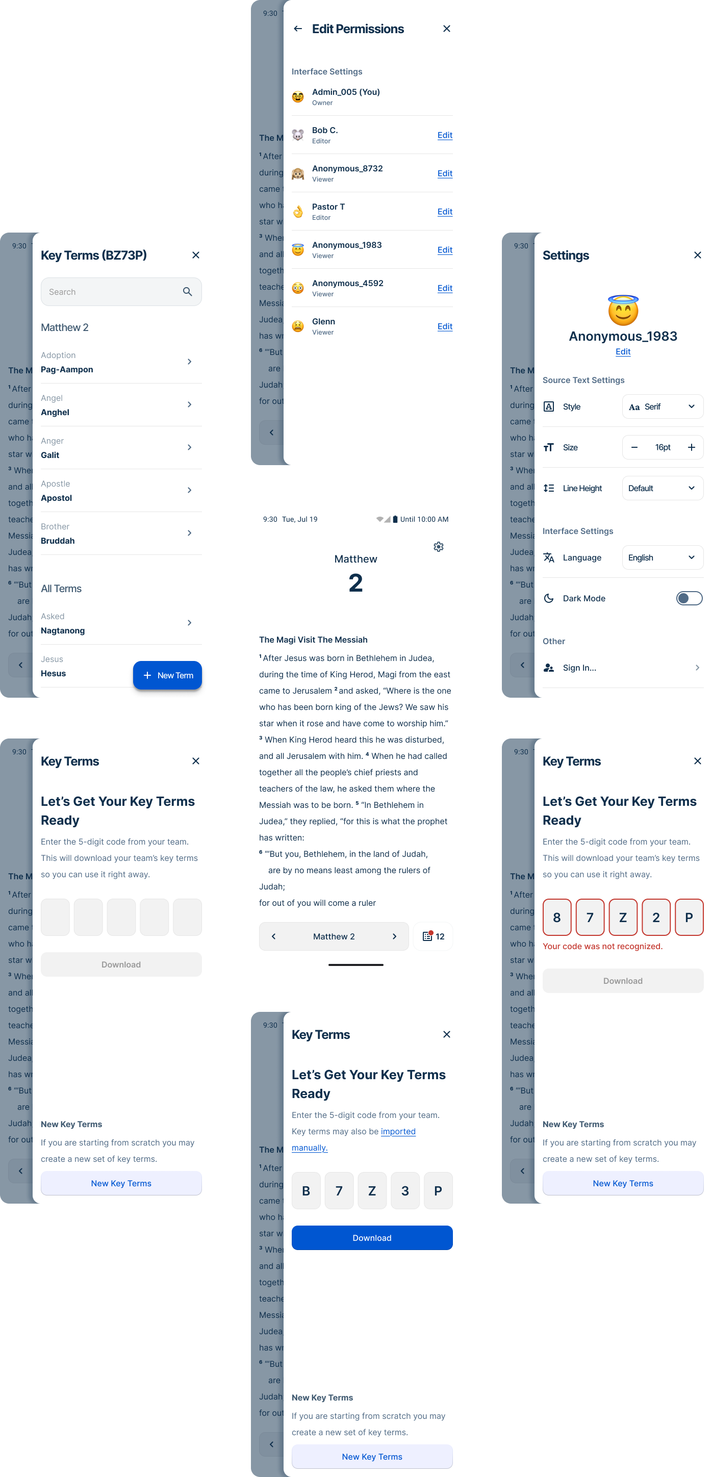
Final Design
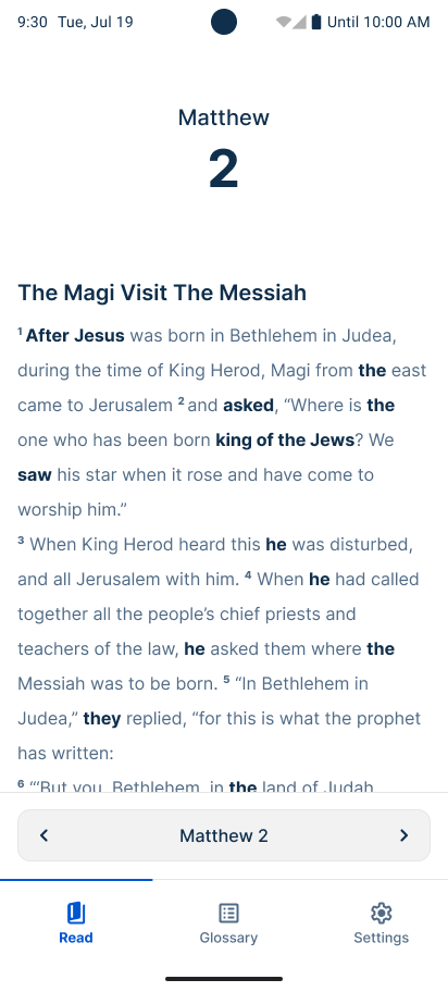
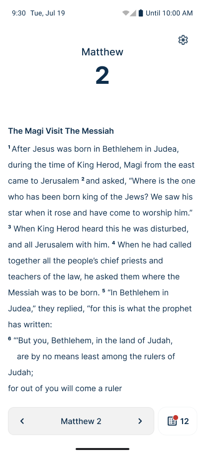
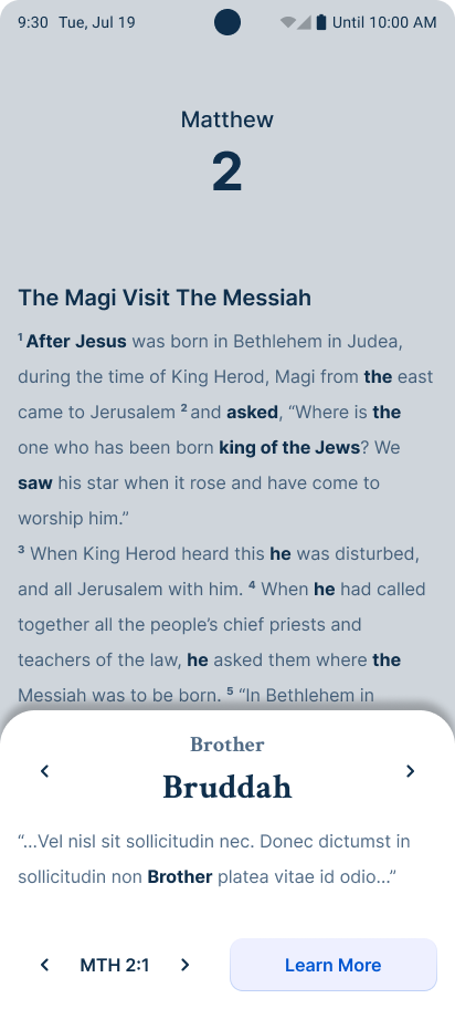
Read Page
The is the users’ home screen where they will spend a vast majority of their time. The following changes were made based on usability test results:
Removed Inline Styling: Our research showed that users don’t need to be constantly reminded of how to spell a word, and as such, the styling became a huge distraction.
Simplified Navigation: Our user testing also showed that users sometimes got lost when navigating through the app. We replaced the app bar with more contextual overlays.
New
Old
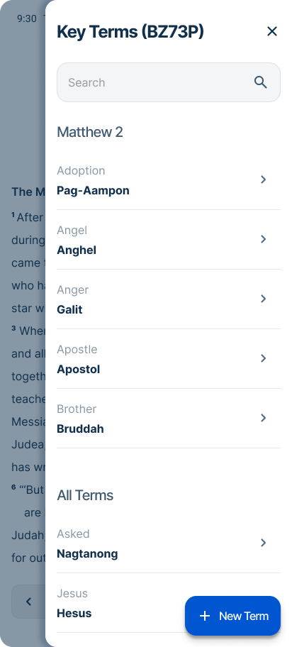
Key Terms
Key terms were originally separated based on their context. The “drawer” would handle displaying terms that appeared on the current chapter, while the “Key Terms” page handled the entire list. These were consolidated into a single component
Simpler Interaction: The new design removes the need to accommodate the “stacked key terms” problem we ran into.
Shared Context: Key terms are shared in the same interface and make it easy for the user to know where to look.
Old
New
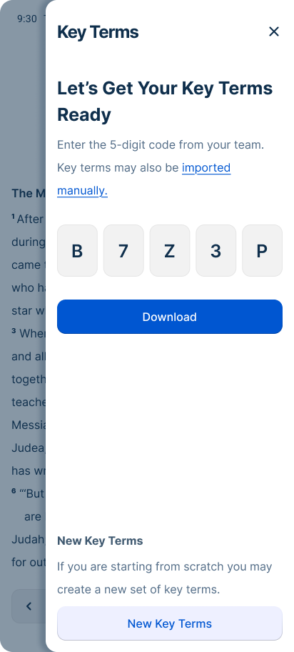
Onboarding
Key Terms are shared across multiple people within a team, which means it needs a simple way to distribute. A 5 digit code was used as an easy to share identifier.
Unique Characters: The code omits characters that can be mistaken for other characters, such as 1, I, 0, 0, B, 8.
Stylized Input: The code input is stylized to suggest to the user that it is expecting a code that is 5 digits long.
New
New
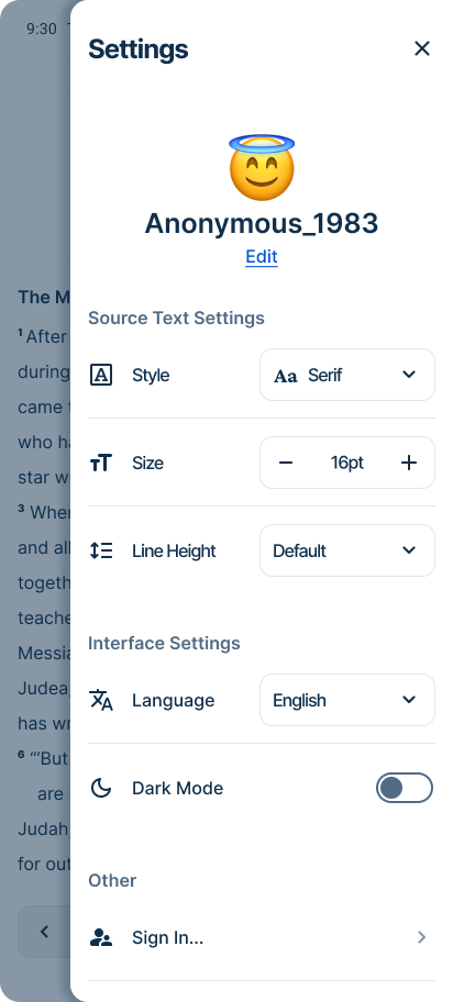
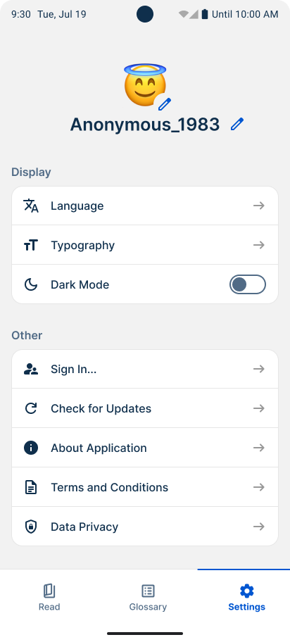
Settings
Settings offers the user options to customize their experience with Spotlight through various stylistic options.
Stylized Controls: Controls offer a more visual clue as to what they do instead relying on more navigation.
Clearer Labels: Some features have been renamed and organized to more accurately articulate their intended use, such as separating display into “Source text” and “Interface.”
Context: Changes the user makes in this screen are more immediately noticed in the new design. If the user changes the source text size, they can see change happen in real time.
Old
New
Results
Spotlight launched to its first language event with limited rollout, and long-term translation quality data is still being gathered. However, early findings validated several core hypotheses that informed the product's direction.
Mobile reduced hardware anxiety. Feedback from the field confirmed that users were significantly more comfortable engaging with Spotlight on their own personal devices than with organization-provided hardware — validating the mobile-first platform decision and providing a clear signal to continue investing in mobile solutions.
Focused scope was the right call. Observational research and stakeholder input confirmed that translators reference key terms occasionally rather than constantly — they reach consensus as a group and move on. De-emphasizing the glossary in favor of lightweight, contextual access proved to be the right tradeoff, and field use confirmed it.
The MVP did its job. Spotlight was explicitly scoped as a learning-focused release, and it delivered on that goal — surfacing real usage patterns, validating platform assumptions, and identifying clear directions for future iteration.
Final Thoughts
Spotlight reinforced the value of defining success before you ship. By framing the MVP around learning rather than polish, we gave ourselves permission to validate assumptions in the field without waiting for a perfect product. The platform decision — mobile over desktop — proved correct from the first event. In future projects I would invest earlier in product positioning and be more aggressive about cutting scope that doesn't directly serve the core learning goal.
More Projects
Dovetail: A web-based translation refinement tool shaped entirely by research before a single production screen was finalized. This case study documents the discovery process, key research findings, and the design decisions that followed. Read Case Study
Orature: A desktop oral translation tool that launched with strong technical capability and limited adoption. This case study is an honest post-mortem on what went wrong and includes a full strategic redesign proposal. Read Case Study
BTT Design System: A cross-product design system built from scratch across five applications. This case study covers the architecture, the tradeoffs, and what building a system without formal governance actually looks like in practice. Read Case Study